

Slashing API Response Times by 80%: Our Journey from 1.2s to 225ms
How we eliminated N+1 queries, rebuilt our serialization layer, and achieved a 5x performance improvement that directly impacted our users.

About Lifen
At Lifen, we’re building the data infrastructure that powers modern healthcare. Founded in 2015, we serve more than 800 healthcare facilities across France.
Our mission is simple but critical: enable instant access to quality health data for better patient care. Using AI-powered solutions, we help healthcare providers securely share, process, and integrate medical information across fragmented systems.
What is Lifen Integration?
Lifen Integration is our flagship product that automates the processing and integration of medical documents into Electronic Health Record (EHR) systems. Think of it as an intelligent document router: medical reports arrive from various sources—secure health messaging systems (MSSanté), external laboratories, imaging centres, biomedical devices, or even paper documents—and our platform uses AI to automatically extract key information (patient identity, procedure dates, document types), verify it against hospital databases, and integrate everything seamlessly into the appropriate patient record in the EHR.
For healthcare professionals, this means no more manual data entry, no more identity verification errors, and no more hunting through multiple systems to find patient information. For hospitals processing hundreds or thousands of documents daily, it’s the difference between hours of administrative burden and seconds of automated efficiency.
But here’s the challenge: when your product directly impacts how quickly healthcare professionals can access critical patient information, performance isn’t just a nice-to-have—it’s a clinical imperative.
When Performance Becomes a User Experience Problem
One of our largest clients (a hospital) reached out with feedback that stopped us in our tracks: their team was experiencing frustrating delays when loading their daily work dashboard. For healthcare professionals processing hundreds of medical documents per day (lab results, imaging reports, discharge summaries), every second of delay compounds into lost time that could be spent on patient care.
At Lifen, we build data infrastructure for healthcare providers.
Our integration platform, a Rails API serving a React frontend, helps hospitals process and route medical documents from external sources into their Electronic Health Record systems.
Think of it as a smart mailbox: medical documents arrive from various external sources, our platform receives them, and healthcare professionals review and integrate them into the appropriate patient records.
For us, performance isn’t just about user experience: it directly impacts how quickly healthcare professionals can access critical patient information.
When we dug into our Application Performance Monitoring (APM) dashboards (we are using AppSignal for this purpose), the reality was worse than we thought. Our most critical API endpoints (the ones that powered the daily workflows of thousands of healthcare professionals) were among the slowest in our entire system.
The numbers were concerning:
Average response time: 1.15 seconds for our integration request endpoint
For our largest clients: response times regularly exceeded 5 seconds on unfiltered requests
These endpoints handled thousands of requests daily. The cumulative impact was massive
This wasn’t a theoretical performance problem. Real users were waiting, frustrated, while our servers churned through what should have been simple list queries.
It was time to find out why.
What Our Monitoring Revealed
We started where any performance investigation should: tracing actual production requests to understand exactly where time was being spent. Using our APM tool, we analyzed sample traces of slow requests from our largest clients. What we found was a cascade of compounding problems.
1. The N+1 Query Cascade
The first culprit was a classic but concerning anti-pattern: the N+1 query problem.
For those unfamiliar, the N+1 query problem occurs when an application makes one query to fetch a list of records, then makes N additional queries to fetch related data for each record.
In our context: An attachment refers to the actual medical document file (PDF, image, etc.) associated with a document—for example, a lab report PDF or an imaging study scan. Metadata refers to the structured information about that document: patient identity, procedure dates, document type (lab result, radiology report, etc.), originating provider, and other fields that help classify and route the document correctly. In healthcare, this distinction matters: the attachment is what clinicians read, while metadata is what our system uses to file it in the right patient record.
Here’s what the code looked like:
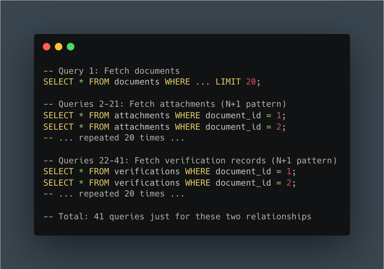
The pattern repeated across multiple relationships. Our APM traces showed:
N+1 queries on document attachments
N+1 queries on verification records
N+1 queries on related metadata tables
For a “simple” list of 20 documents, we were executing over 60 queries just to fetch related data that should have been loaded in 2-3 efficient queries.
2. Synchronous External Service Calls
The second major bottleneck was more insidious: synchronous HTTP calls to external healthcare data services during response serialization.
Our system integrates with external services using a Healthcare Systems Standard (FHIR) to fetch additional medical information (patients data, etc). The problem? We were making these calls synchronously (waiting for each response before continuing) right in the middle of serializing our API response.
The numbers from our APM traces told the story:
Slow queries on connector configuration: ~500ms
Cache lookup operations: ~440ms
Multiple cache read operations: 30-100ms each
We had a caching layer, but it wasn’t enough. Cache misses meant waiting for external service responses, and even cache hits added hundreds of milliseconds due to inefficient cache key lookups.
3. Over-Fetching Data
The third anti-pattern was subtler but equally damaging: we were loading far more data than we needed.
Our database queries were fetching complete related objects even when the UI only displayed a tiny fraction of their fields. The most egregious example: we loaded complete patient records (30+ database columns) when the dashboard only displayed their first and last names.
This pattern repeated everywhere:
Loading full provider records to display a single name field
Fetching complete verification objects when we only needed a status flag
Querying tables that were irrelevant to the current dashboard context
4. The SQL Query Avalanche
When we finally counted up all the queries for a single API request, the number was shocking:
More than 200 SQL queries per API call.
This wasn’t just a performance problem. It was also a database connection pool problem, a network overhead problem, and a maintainability nightmare. No amount of index optimization could fix this. We simply had too many queries.
Our APM tool’s waterfall chart painted a clear picture: most of our response time was spent waiting on databases, waiting on cache, and waiting on external services:
5. The Developer Experience Problem
As we dug deeper, we realized the performance issues were symptoms of a larger problem: accumulated technical debt that made our codebase increasingly difficult to work with.
Legacy serialization complexity:
Our serialization system had evolved over years, resulting in two parallel code paths: legacy serializers and newer Blueprint-based serializers (using the gem of the same name).
The migration between them was incomplete: some Blueprints were partially integrated, most weren’t used at all. Engineers couldn’t easily predict what data would be included in a response without tracing through multiple layers of inheritance.
Context-driven API design:
The frontend would request abstract dashboard “types,” and the backend would “intelligently” compute the appropriate payload. This created tight coupling between frontend and backend: changes in one rippled unpredictably into the other.
Impact on velocity:
PR review times were impacted due to complexity
New engineers needed significant time to understand a single endpoint
Engineers hesitated to make changes due to unclear side effects
Questions like “will this change affect the other dashboard?” were common and hard to answer
It was clear: we couldn’t just optimize the existing code. We needed a fundamental rethink.
Want More Engineering Insights?
We regularly share deep dives into how we build and scale healthcare technology. From API architecture to AI-powered data processing, our engineering team writes about solving real-world challenges at the intersection of healthcare and technology.
Subscribe to stay updated on how we’re building the future of healthcare infrastructure.
Building API V2 from the Ground Up
The Strategic Decision: V2, Not V1.1
After a few attempts to improve performance while maintaining backward compatibility, we learned a lesson: “Recent attempts to improve performance and reduce technical debt taught us that trying to enhance our APIs without introducing breaking changes was very complex and often unsatisfying.”
Incremental improvement wasn’t working. We needed permission to do things right.
The V2 approach:
Create new endpoints under an explicit v2 namespace
Make V2 explicitly incompatible with V1 patterns
Migrate frontend and backend in parallel
Use feature flags to control rollout
Validate with production traffic before generalizing
We started with the highest-impact endpoint: the “Integrations worklist” that powered the dashboard our largest clients used most heavily.
Technical Architecture Changes
1. Minimal, Purpose-Built Serialization
The foundation of our V2 approach was rethinking what data we returned. Instead of over-inclusive bundles, we designed minimal, dashboard-specific payloads.
We chose to keep Blueprinter as our serialization library but extended it with blueprinter-activerecord, a gem that provides built-in tools to preload resources and associations, and thus help prevent N+1 queries.
We started by auditing exactly what fields the frontend displayed in the dashboard. Then, we built a Blueprint that included only those fields: no more, no less.
Here’s what our new response structure looked like:
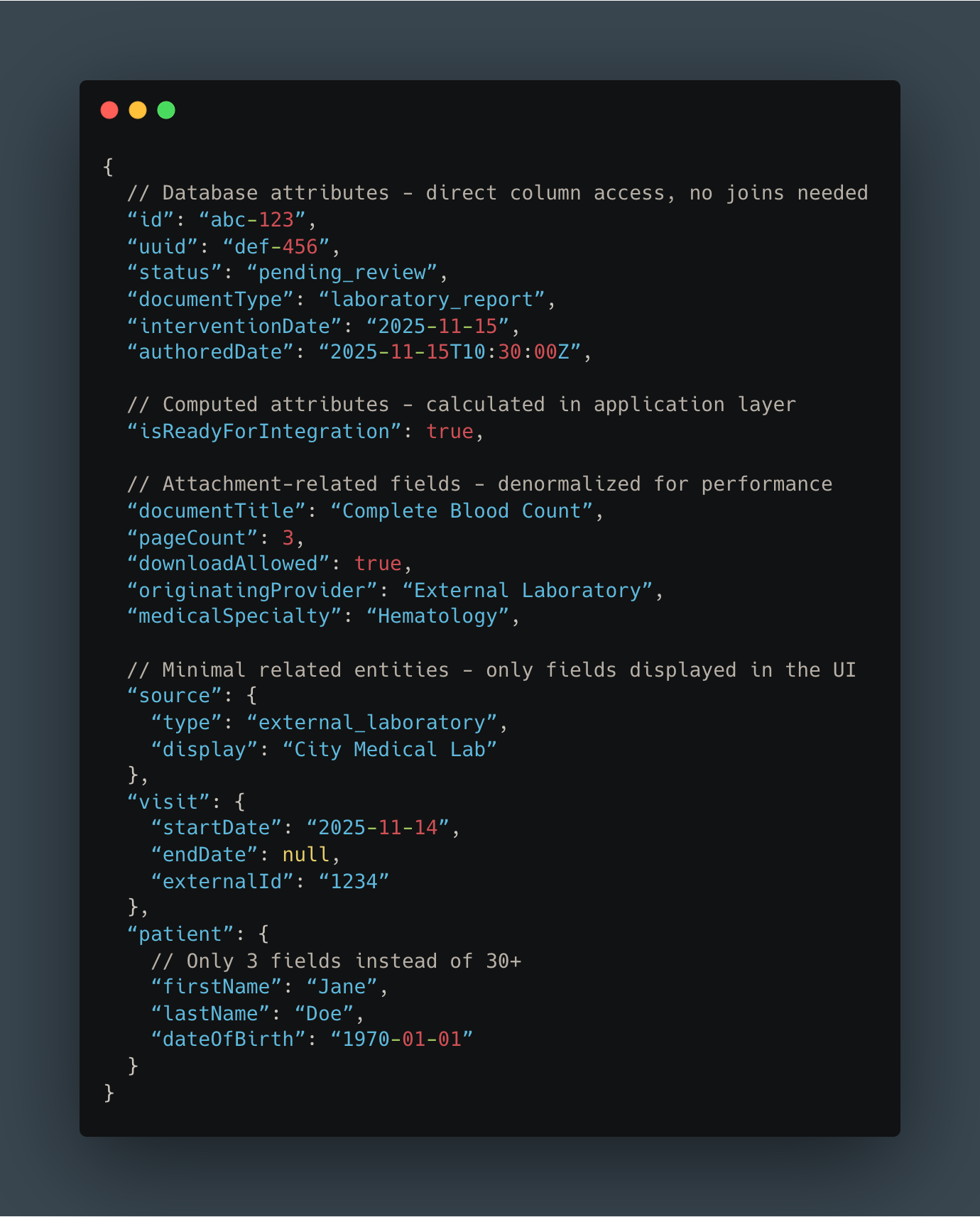
Key differences from V1:
Most attributes come directly from database columns (no expensive joins)
Patient object contains only 3 fields instead of 30+
Removed all data irrelevant to this specific dashboard
Clear, predictable structure with no hidden conditional logic
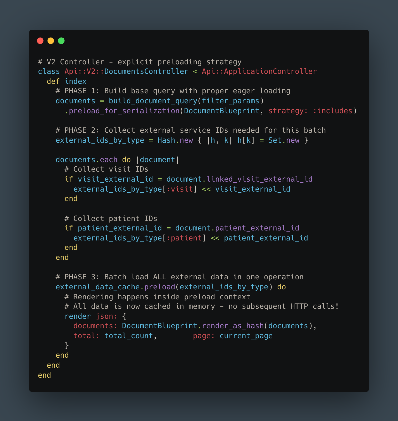
2. Smart Association Preloading
The next challenge was eliminating those N+1 queries. Instead of making multiple database queries or HTTP calls during serialization, we implemented a three-phase approach:
Collect all required IDs upfront
Batch-load all related data in efficient bulk queries
Render the response with everything already in memory
Here’s what that looked like in code:
The transformation in query patterns was dramatic:
BEFORE - N+1 pattern:
AFTER - Batch loading:
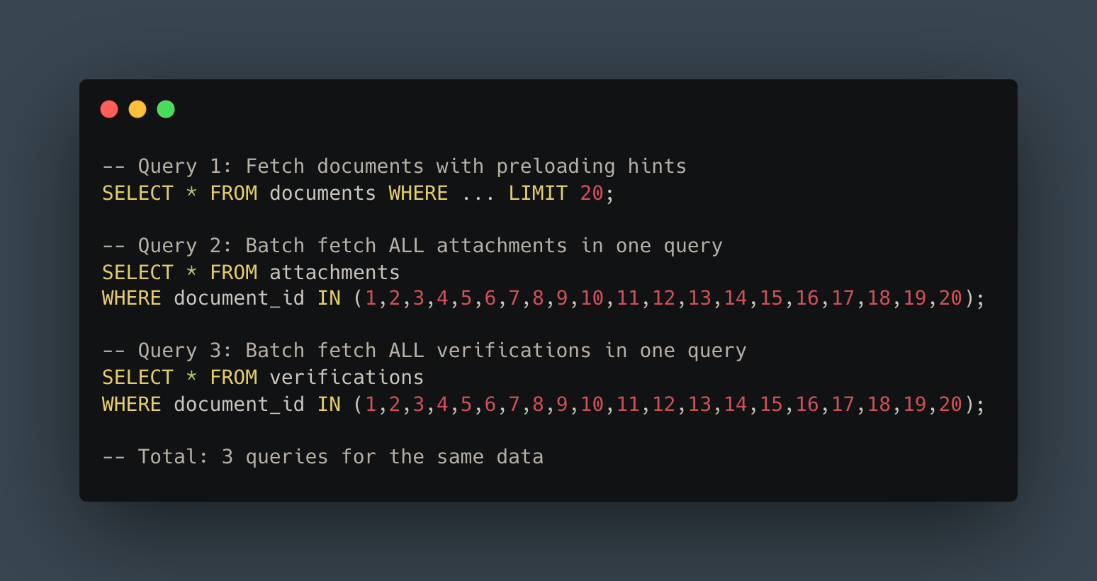
From 41 queries to 3. That’s a 93% reduction, and the pattern extended across all our relationships.
For external service calls, the improvement was even more dramatic. Instead of making 20 separate HTTP requests (or relying on an inadequate cache), we collected all IDs, made a single batch request, and loaded everything into memory before rendering. Result: O(1) external calls instead of O(n).
3. Explicit Filtering
In V1, the frontend requested abstract dashboard “types” and the backend guessed what filters to apply. In V2, we flipped the responsibility: the frontend explicitly states every filter it wants.
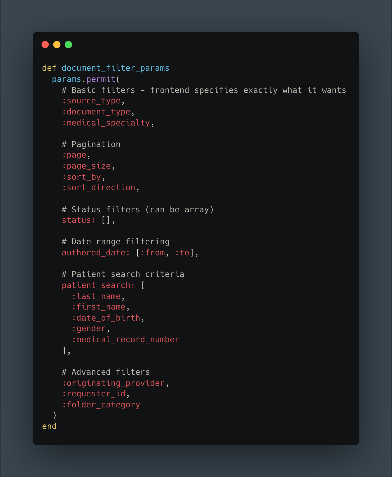
Benefits:
Backend doesn’t need to “understand” UI context
Clear separation of concerns: frontend owns filtering logic
Easy to reason about and test independently
More RESTful and predictable API design
4. OpenAPI Documentation & Type Safety
The final piece was ensuring our new API would stay maintainable. We used RSwag to generate OpenAPI documentation directly from our test suite.

The benefits were immediate:
Living documentation that’s always accurate (outdated docs = failing tests)
TypeScript types automatically generated for frontend
N+1 detection built into test suite
Contract testing between frontend and backend
Onboarding docs for new developers
Frontend Changes
On the React side, we created new dashboard components specifically for V2. Using auto-generated TypeScript types from our OpenAPI spec, the frontend team could develop with confidence that their code matched the API contract.
Feature flags controlled which version users saw, allowing us to gradually roll out: 5% → 25% → 50% → 100% over two weeks, monitoring metrics at each stage.
The Results: Numbers Don’t Lie
After a couple of weeks of development and careful rollout, we finally had production metrics from V2. The improvements exceeded our expectations.
Performance Metrics
Response Time - Average:
Before: 1,175ms
After: 225ms
Improvement: 5.2x faster
Response Time - 90th Percentile (P90):
Before: 1,900ms
After: 524ms
Improvement: 3.6x faster
The P90 metric is particularly important: it represents the experience for 90% of users, including those on slower connections or during peak load times.
Payload Size:
Reduced by ~3x for a typical page of 20 documents
Faster network transfer, especially critical for mobile users
Reduced client-side memory consumption
Faster JSON parsing in the browser
Database Query Count:
Before: 200+ queries per request
After: <10 queries per request
Improvement: ~95% reduction in database load
With over 50,000 API calls per day on this endpoint alone, the cumulative impact was noticeable:
Dramatically reduced pressure on database connection pools
Better resource utilization across the entire infrastructure
Code Quality Improvements
The benefits went beyond raw performance numbers.
Measurable code improvements:
V1 Controller: 250 lines, cyclomatic complexity: 28
V2 Controller: 120 lines, cyclomatic complexity: 8
V1 Serializer: 400 lines across 5 files with unclear dependencies
V2 Serializer: 150 lines in a single Blueprint file with explicit preloading
Developer experience improvements:
PR review time reduced
Onboarding time for new engineers cut significantly
Bug fix time: Clear code paths made debugging significantly faster
Confidence: Comprehensive tests + clear architecture = fewer production rollbacks
Here’s the code comparison:
V1:
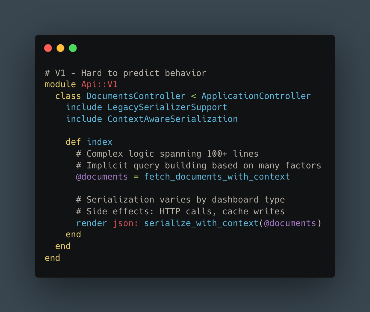
V2:
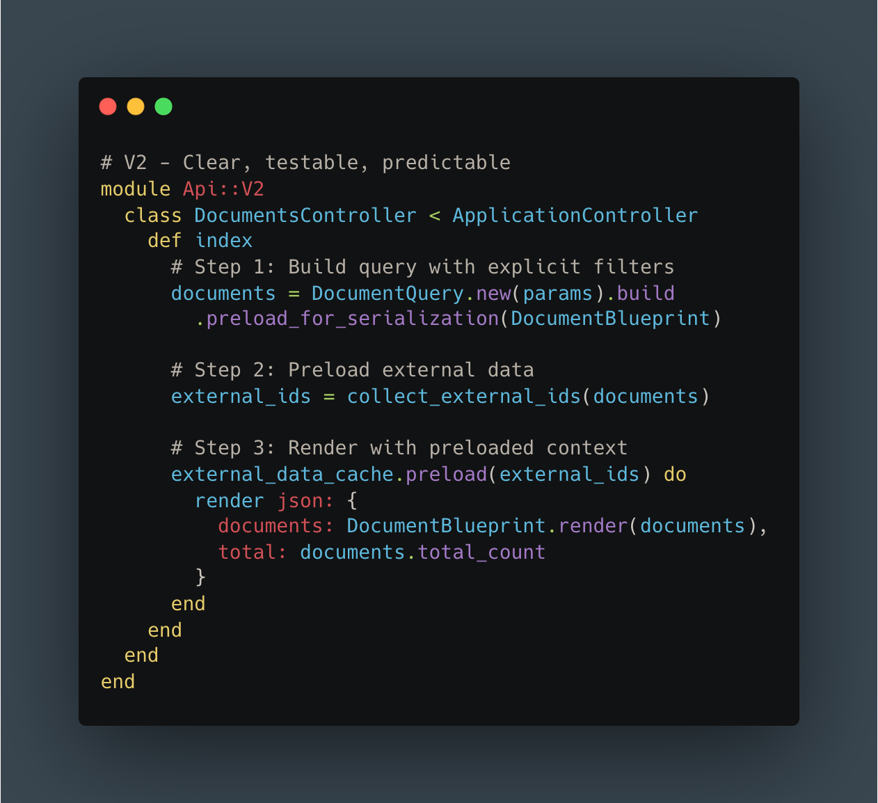
The difference speaks for itself.
Business Impact
Quantified improvements:
Reduced infrastructure costs for this service (exact savings are still being calculated)
No customer complaints about dashboard performance since V2 launch
faster feature delivery estimated due to simplified codebase
Qualitative feedback (anonymized):
“The new dashboard loads almost instantly now. Thank you!”
“We can finally process documents as quickly as they arrive”
Engineering team morale improved significantly with cleaner codebase
In healthcare, these improvements translate directly to patient care.
Lessons Learned
1. Sometimes a Clean Break Is Better
Our attempts to incrementally improve V1 taught us that sometimes you need permission to start fresh. V2 allowed us to rethink our architecture from first principles without the constraints of backward compatibility.
Breaking changes are scary. But feature flags and gradual rollouts mitigate the risk. The psychological benefit of a fresh start (for both code quality and team morale) shouldn’t be underestimated.
2. Measure Everything, Question Nothing
Application Performance Monitoring was crucial to identifying specific bottlenecks. Without concrete metrics (200+ queries, 500ms external calls, 440ms cache operations), we would have been optimizing based on intuition rather than data.
We continue monitoring V2 closely to catch any regressions early.
3. Start with the Highest-Impact Work
We chose to start with our highest-traffic, slowest endpoint. Validating the V2 approach with real production traffic before generalizing to other endpoints was crucial. The lessons we learned from this rollout directly informed how we’ll tackle the remaining endpoints.
ROI-driven prioritization keeps teams focused on work that matters.
4. Association Preloading Is Non-Negotiable at Scale
Tools like blueprinter-activerecord make it dramatically easier to systematically eliminate N+1 queries. Batch external service requests are orders of magnitude more efficient than sequential calls.
The pattern is a bit harder to implement initially, but it pays dividends at scale. N+1 detection should be a standard part of code review.
5. Documentation as Code Actually Works
RSwag specs generate documentation, enable type safety, and serve as contract tests, all from a single source of truth. Documentation never falls out of sync because outdated docs mean failing tests.
This reduces communication overhead between frontend and backend teams and accelerates onboarding for new developers.
6. Performance Is a Feature
Users notice and appreciate performance improvements.
Performance optimization compounds: faster APIs enable better UX, which enables new features, which drive adoption. Technical excellence isn’t separate from product excellence; they’re inseparable.
What’s Next
We’re not done yet.
Immediate priorities:
Generalize the pattern: Apply V2 architecture to other related dashboards, and more broadly to any other high-traffic route
Continuous monitoring: Track V2 metrics closely and iterate on optimization opportunities
Knowledge sharing: Internal tech talks and comprehensive documentation to share these patterns across the team
Future optimizations:
Edge caching: Implement caching for frequently accessed, low-volatility data
Database tuning: Further optimize indexes based on V2 query patterns
Read replicas: Offload read-heavy queries to replica databases
Scaling considerations:
Our document volume grows ~20% year-over-year. We need to ensure V2 patterns continue to scale. We’re already planning for 10x our current traffic volume.
Conclusion: Performance as a Product Value
We started with frustrated users experiencing 1.2-second load times that impacted their daily clinical workflows. Through systematic performance monitoring, we identified the root causes: N+1 queries, synchronous external calls, and over-fetching.
We built API V2 from the ground up with smart preloading, minimal payloads, and explicit contracts. The result: 5x performance improvement and a dramatically simpler codebase that’s easier to maintain and extend.
But the real impact goes beyond milliseconds and metrics. In healthcare, every second saved is time healthcare professionals can spend on patient care.
The patterns we developed (batch preloading, minimal serialization, explicit contracts, documentation as code) are now templates for all future API work at Lifen. We didn’t just optimize one endpoint; we established a new standard for how we build APIs.
What made this succeed:
Team buy-in: Everyone understood why this mattered
Incremental rollout: Feature flags let us deploy confidently
Metrics-driven: Data guided every decision
Clean slate: V2 gave us permission to do things right
Performance optimization at scale in healthcare presents unique challenges. If you’re passionate about building systems that directly impact patient care, we’d love to hear from you.
Explore Life at Lifen
Curious about how we tackle challenges like this? Visit our Welcome to the Jungle page to discover our culture, meet the team, and explore open roles.
Stay Connected
Subscribe to get insights on healthcare innovation, engineering best practices, and what makes Lifen unique.